The Evolution of British Newspaper Design: A Typographical Journey
The history of British newspapers is an enthralling narrative of how they've not only documented the course of events but also evolved their design and typography in tandem with the times. From their nascent origins in the 17th century to their digital renaissance in the 21st century, British newspaper design has undergone a mesmerizing transformation that closely mirrors the fonts they employed.
Embark on a journey through time, exploring the multifaceted evolution of British newspaper design and the pivotal role fonts have played in shaping their visual identity.
17th to 19th Century: The Birth of Newspapers
The inception of British newspapers in the 17th century was marked by a humble yet impactful design. Early publications, such as the London Gazette (1665), were predominantly text-heavy, and fonts played a central role in their presentation. These newspapers predominantly featured blackletter fonts, also known as Gothic or Old English. Characterized by their intricate, angular letterforms, blackletter fonts lent an air of authority and tradition to the publications of that time. However, their ornate nature made them challenging to read, particularly for modern readers.
As the 18th and 19th centuries unfolded, British newspapers embarked on a journey towards improved readability. Serif fonts, exemplified by the iconic Times New Roman, emerged as the preferred choice. These fonts presented clean, upright letterforms with serifs, enhancing legibility. They became a mainstay in newspaper design for decades to come.
20th Century: The Era of Modernism
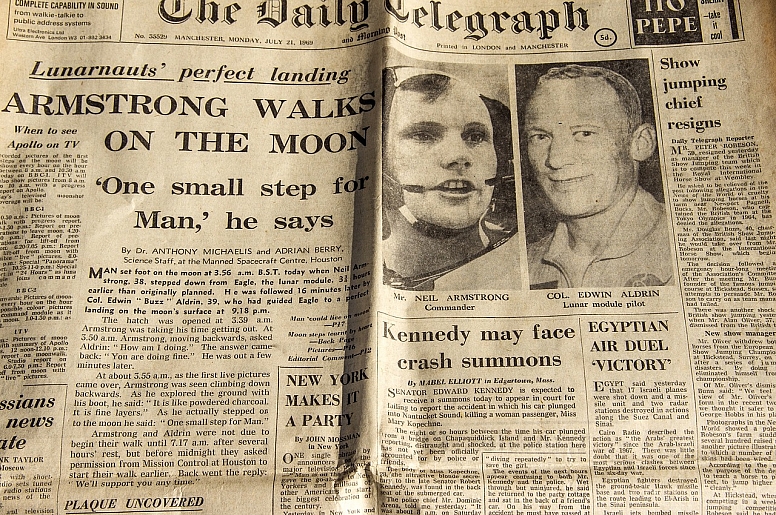
The 20th century ushered in significant shifts in British newspaper design, heavily influenced by the broader modernist movement. Newspapers began prioritizing clean lines, bold headlines, and an efficient use of space. Fonts evolved towards geometric sans-serif typefaces like Helvetica and Gill Sans. These typefaces, characterized by their minimalistic, uncluttered appearance, resonated with modernist design principles. Additionally, the advent of new printing technologies enabled greater flexibility in font sizes and styles, enhancing readability and visual appeal.
Late 20th Century: The Digital Revolution
The late 20th century marked a pivotal moment in newspaper history—the digital revolution. Newspapers transitioned from print to digital formats, necessitating responsive and adaptable design to cater to various devices and screen sizes. This shift in medium demanded a new approach to typography and layout.
Digital publications embraced a blend of typefaces, often marrying traditional serif fonts for body text with bold, attention-grabbing sans-serif fonts for headlines and pull quotes. The choice of fonts became a potent tool for branding and differentiation in an increasingly competitive market. Custom fonts were developed to fortify brand identities, making newspapers instantly recognizable to their online readership.
21st Century: Digital Dominance
With the rise of the internet, British newspapers faced new challenges as they embraced the digital realm. Their design had to be responsive and adaptable, catering to the preferences of a diverse online audience. Fonts continued to play a pivotal role in achieving this balance.
Digital publications explored a diverse range of typefaces, often combining serif and sans-serif fonts to strike a balance between readability and contemporary aesthetics. Custom digital fonts became common, serving as powerful branding elements. Designers adapted to the fast-paced nature of online journalism by optimizing typography for screen readability, ensuring that articles remained engaging and accessible to digital readers.
The evolution of British newspaper design is a captivating journey that closely parallels the fonts used. From the ornate blackletter fonts of the 17th century to the sleek sans-serif typefaces of the 20th century and the custom digital fonts of the 21st century, newspaper design has adapted to changing tastes, technologies, and reader preferences.
How Events and Regulations Shaped British Newspaper Design
The history of British newspaper design and typography is intricately intertwined with the events and regulations of the times. Throughout history, specific historical events, government regulations, and censorship have left indelible marks on the layout, fonts, and overall visual identity of newspapers in the United Kingdom. These are some of the key historical contexts that have profoundly influenced British newspaper design.
1. Wartime Urgency and Patriotism
Wartime periods have consistently had a profound impact on British newspaper design and typography. During times of conflict, newspapers, as well as war-time posters, adopted bold and dramatic fonts to convey urgency, rally patriotism, and capture the gravity of the situation. Two world wars, in particular, stand out as pivotal moments in this regard:
- World War I (1914-1918): British newspapers during World War I used heavy, bold typefaces to deliver front-page headlines that commanded immediate attention. These fonts conveyed the sense of urgency and the gravity of the war effort, often accompanied by patriotic imagery and slogans. The use of large, bold fonts was a deliberate choice to evoke a sense of national unity and urgency among readers.
- World War II (1939-1945): In World War II, newspapers continued the tradition of using bold fonts, but with a more sophisticated touch. The fonts were not only designed to grab attention but also to maintain readability and professionalism. Newspapers played a crucial role in disseminating wartime news and propaganda, and typography played a key role in shaping public perception.
2. Government Regulations and Censorship
Government regulations and censorship have been another influential factor in shaping British newspaper design and typography. Over the centuries, governments have used various measures to control the content and presentation of newspapers. Here are a few notable examples:
- Licensing Act of 1662: In the late 17th century, the Licensing Act of 1662 imposed strict government control over publications. Newspapers had to obtain licenses, and the government had the authority to regulate content and even typography. As a result, newspapers of that era often adopted formal, government-approved fonts and layouts.
- Press Licensing Act of 1855: This act, which aimed to curb the publication of seditious materials, further regulated the newspaper industry. It influenced the design by discouraging certain types of content and promoting a more subdued and conventional use of fonts.
- Censorship during World War II: During World War II, the British government imposed strict censorship on newspapers to prevent the dissemination of sensitive information that could aid the enemy. This censorship extended to typography, as newspapers had to be cautious about revealing troop movements, military strategies, or other classified information.
3. Political Movements and Reforms
Political movements and reforms have also had a significant impact on newspaper design and fonts. For example:
- The Reform Act of 1832: This act expanded voting rights and led to the emergence of more politically diverse newspapers. These publications often used fonts and layouts that reflected their political ideologies, catering to specific readerships.
- The Suffragette Movement: The women's suffrage movement in the early 20th century saw newspapers advocating for women's rights and the right to vote. Typography in these publications often conveyed a sense of empowerment and urgency, reflecting the movement's goals.
British newspaper design and typography have been profoundly influenced by historical events, government regulations, and censorship. The choice of fonts and layouts has not only been a matter of aesthetics but also a reflection of the social, political, and cultural contexts in which newspapers operated. These historical contexts continue to shape the design choices made by British newspapers, ensuring that each era's unique challenges and aspirations are encapsulated in the visual identity of these publications.
As we venture further into the 21st century, the world of typography and newspaper design continues to evolve, shaped by the ever-changing digital landscape and the quest for more engaging, visually appealing content.
The rich history of British newspapers and their design choices stands as a testament to the enduring power of typography in storytelling and communication, serving as a visual reflection of the times in which they were created.
With each new era, British newspapers have adapted, innovated, and captivated readers, ensuring their continued relevance in an ever-evolving media landscape.
Future Trends in British Newspaper Design: Embracing Technological Advancements and Innovative Typography
The world of British newspaper design is on the cusp of another transformative era, one that is marked by the integration of cutting-edge technologies and the continual evolution of typographic choices. As we peer into the future, several exciting trends are poised to reshape the landscape of newspaper design in the United Kingdom.
1. AI-Driven Layout Optimization
The integration of artificial intelligence (AI) is set to revolutionize newspaper layout and design. AI algorithms, with their ability to analyze vast amounts of data and user behaviour, will be used to optimize the placement of content on both print and digital platforms. Here's how AI-driven layout optimization is expected to impact British newspaper design:
- Personalization: AI will enable newspapers to tailor content and layouts to individual reader preferences, ensuring a more personalized and engaging experience. Readers will see content and fonts that resonate with their interests and reading habits.
- Content Placement: AI algorithms will determine the optimal placement of articles, images, and advertisements to maximize reader engagement and retention. This will lead to more intuitive and visually appealing layouts.
- Data-Driven Typography: AI will analyze data on font readability and user interactions to recommend typefaces and font sizes that enhance the reading experience, especially on digital devices.
2. Augmented Reality (AR) for Immersive Storytelling
Augmented reality, often associated with gaming and entertainment, is poised to transform the way newspapers tell stories. British newspapers will increasingly leverage AR to provide immersive, interactive experiences for their readers:
- AR-Enhanced Print: Newspapers may offer AR applications that allow readers to scan printed articles or images with their smartphones or tablets, unlocking additional multimedia content, 3D models, or interactive infographics.
- Virtual Tours: Newspapers can use AR to take readers on virtual tours of historical sites, provide in-depth explorations of news events, or offer 360-degree views of locations mentioned in articles.
- Interactive Data Visualization: Complex data sets can be transformed into interactive AR visualizations, making statistics and trends more accessible and engaging.
3. Evolution of Typography and Design Aesthetics
As technology evolves, so too will font choices and design aesthetics. Here's how typography and design might adapt in the future:
- Variable Fonts: Variable fonts, which allow for real-time adjustments in weight, width, and other characteristics, will become more prevalent. This adaptability will ensure optimal readability on various screen sizes and resolutions.
- Experimental Fonts: Designers will continue to experiment with fonts that push the boundaries of readability and aesthetics. Futuristic, unconventional typefaces may be used for artistic or thematic purposes.
- Accessibility-Driven Typography: With a growing focus on accessibility, fonts designed to accommodate individuals with disabilities will gain prominence. Newspapers will prioritize legibility and inclusivity in their typography choices.
- Multilingual Typography: As newspapers reach a global audience, multilingual typography will become more common. Designers will explore innovative ways to integrate different scripts seamlessly.
The future of British newspaper design promises to be a captivating fusion of technology and typography. AI-driven layout optimization will enhance personalization and readability, while augmented reality will elevate storytelling to new heights, providing immersive experiences for readers.
In parallel, the evolution of typography and design aesthetics will reflect the dynamic nature of modern journalism. Variable fonts, experimental typefaces, accessibility-driven design, and multilingual typography will ensure that newspapers remain not only informative but also visually engaging and inclusive.
As we move forward, the convergence of these trends will reshape British newspaper design, ensuring that these venerable institutions continue to captivate and inform readers in a rapidly evolving digital age. The future of newspaper design is both promising and dynamic, offering new possibilities for engaging with news and information.

